Sundays, Family paint Day…with Hannigans Paint & Decor
April 29, 2020
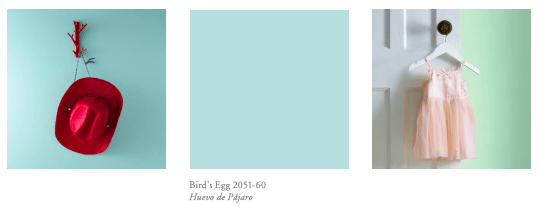
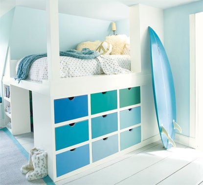
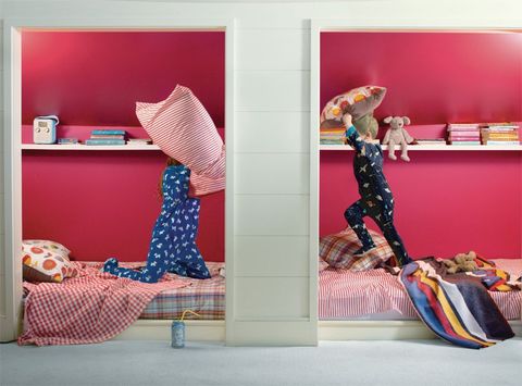
Maybe it’s time to refresh the kids bedrooms and give them a new smile when they walk into their own space.
From dreamy pastels to energetic brights, colour makes magic in kids’ rooms.
As you survey the bounty of colour available for kids of all ages, breathe
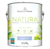
easy: Benjamin Moore’s greenest paint, Natura®, is CERTIFIED asthma & allergy friendly® and has zero VOCs and zero emissions.
The CERTIFIED ASTHMA & ALLERGY FRIENDLY Mark is a Registered Certification Mark of the ASTHMA AND ALLERGY FOUNDATION OF AMERICA and ALLERGY STANDARDS LTD.
Sundays, Family paint Day…
Balancing Brights
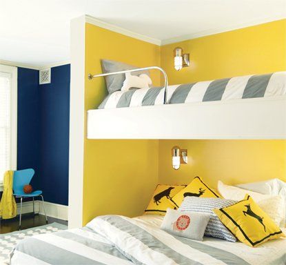
Ask children what colour they want for their room, and big, bright hues top the list. Knowing that this is the space where they sleep, study and play–balance is the key.Here, Yellow Highlighter 2021-40 brings on the bright, softened by Cotton Balls 2145-70 on trim and complemented by Downpour Blue 2063-20 on the back wall. Blending neutrals,
A DIY favourite, our ben® paint line offers a special formulation that makes painting easier with quick-fix drips and smooth touch-ups. like greys and beiges, helps empower the use of vivid colour for bedding, pillows and other room décor–like the cheery, aqua-coloured chair.
Chalk + Paint + Color = Creativity
You can also designate an area of a kid’s room for expressing creativity with chalk. Benjamin Moore’s ben® Chalkboard Paint empowers you to create a dynamic and unique accent wall that your little one will love.
Forget about old-style blackboards: ben Chalkboard Paint is available in 3,500+ paint colours–so no matter what colour the room, you’ve got a huge array of coordinating colour options.
Beyond the Pale
If you’re the practical type, you may be interested in
colour choices that will transition seamlessly from infant to toddler to big kid.
To align a kid’s room alongside their growth spurts, consider reserving bold colours for room décor or furniture, allowing a practical neutral or pale hue on walls to stay tried and true, year after year.
Writing on the Wall
Imagine a wall-sized dedicated easel that is easily wiped clean at day’s end...
Notable® Dry Erase Paint makes it possible. Clear Dry Erase Paint can be used over any existing wall colour, or tinted to whatever colour you wish, magically transforming it into a vibrant dry erase wall. Just hand over the dry erase markers to the kids and see creative inspiration come to life, day after day. There’s also a White option for the dry erase whiteboard traditionalists out there.
Photo Credit: House Beautiful
Keep it Complementary
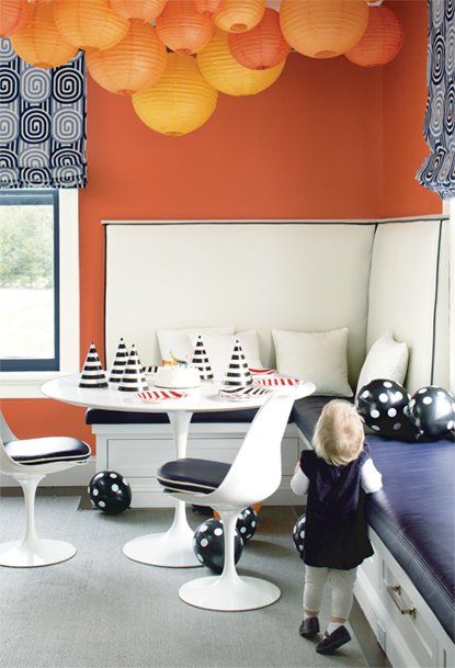
The chemistry that exists between colours on opposite sides of the colour wheel–known as ‘complementary colours’ in colour and design parlance–is palpable. Complementary colour schemes that include primary or bold colours are said to create excitement or high energy (think sports team jerseys).
Explore how these types of happy colour unions–purple & yellow, blue & orange–can infuse any size room with a sense of whimsy. Complementary colour schemes can be a bit too bold for some, so using a primary with a lighter or darker complement offers a more subtle option.
Accent on Fun
Make a secondhand find more kid-centric by reviving it with a fresh coat of paint.
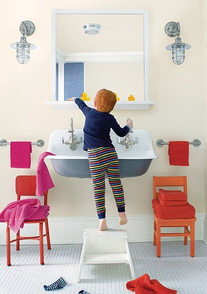
ADVANCE®, used here on these pint-sized bathroom chairs, is low VOC & provides a durable and beautiful furniture-like finish. Accent furniture provides a smile-worthy pop of colour in an otherwise colour-neutral space.
